Design choices to consider for a mobile app audio player
We implemented an audio player on a recent project. If we could do it all again, this is the trade secret advice that we learned and would tell ourselves. This is part of a multi-part article that elaborates on the player from design to implementation.
Design
Before jumping straight into implementation, we made sure to mock up the interaction and visual design.
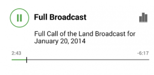
Audio player consisting of display elements and interactive elements
This design could apply to any mobile platform: iOS, Android, Windows, and others.
Our design incorporated the following elements:
- Track title
- Track tagline (not shown above, however would be placed between the title and description)
- Track description
- Playing indicator, shown as equalizer bars with randomized animation
- Play/pause button (interactive)
- Elapsed time & Remaining time
- Progress bar & progress indicator (interactive)
Design Choice: Pause or Stop?
One design choice is that when the user wants to stop the audio, do they have the option to re-start the audio at the same location that they stopped it at? For those old enough to remember, pause and stop had very different functionality on a CD player. When paused, a CD would continue spinning at playing speed, so that when you would press the play/pause button a second time, the track would immediately continue. If stopped, the CD would spin down, and the laser would reset its reading position to the starting point. If you wanted to restart playback, the CD would then need to spin up and move the head to the track position. This resulted in lost time, as you had to wait for the player to get going again.
The analogy carries forward into the Android player, because in the app, the track takes up memory and that memory usage takes resources to load. In effect, when the track is paused, we would not be releasing that memory. If stopped, we would want to release that memory to allow the app to use those resources elsewhere, and so as not to have a large memory footprint on the device.
Our choice was a play/pause button to provide the ease of being able to restart the track quickly and also from the same location where the track was paused. No stop button.
Design Choice: How should the progress indicator behave?
The Progress indicator first and foremost is a visual representation of “how much” of the track has already been played, and how much is left. In addition if desired, it can behave as an interactive control to provide “fast-forward” or “rewind” functionality to the user. If the playback indicator can be manipulated by the user, another question then arises. If the user can grab the playback indicator, by using a tap-and-hold action, and then slide their finger over to another part of the progress bar, does the audio track wait for the user to release their finger before beginning to play at the new location, or does it play immediately? Also, while this interaction is going on, are the elapsed and remaining times reflecting where the user presently “is” in the track, or where they “will be” when they release their finger?
In addition, can the user simply “tap” on the progress bar at a new location to indicate that they would like playback to begin playing from that location? Or, do they have to use the playback indicator to instead grab and move the playback indicator to the new time?
Various apps in the wild behave differently in this regard. There does not seem to be a clear-cut choice and it is up to the designer of the app.
Our choice was to allow the user to navigate the app using the progress indicator (including tapping at new progress indicator locations), and to wait until the user released their finger before playing the track at the new location. During this “seeking” activity, the elapsed and remaining time indicators were showing what was currently playing.
Design Choice: One player or multiple players?
If there is more than one track to be played in the app, as was the case in our app, you have the option of maintaining the “state” of each track across the app. So that if track A was started, then paused at 0:26, a second track, track B could be started from the beginning, and track A would not be stopped or restarted, but would remain at its 0:26 time.
This has implications on memory usage, in that the first track would stay active and its memory requirements in the app would remain until the track was stopped or reset.
Our choice was to reset any other track to 0:00 when a second track was started. This allowed us to simplify the implementation later on, by using only one MediaPlayer object.
Design Choice: Expand/Collapse view?
A summary view might be desirable when there is a large amount of text or images to display along with a track. In the app, it may be desirable to implement an expand and collapse functionality so that the content can be chosen by the user, based on what interests them.
Our choice was to provide the collapsed view to the user so that they could easily scan the available content and expand the track that was most interesting to them. In this case, we did not want the user to be able to control the audio playback of the track in the collapsed view.
This is the first article in a multi-part series. Next: Mobile app audio player state design.