Touch-friendly menu navigation on the web
Designing website navigation that will work on touch devices can be a challenge.
A very common approach for desktop use is some sort of fly out menu – hovering the mouse over a navigation category causes a sub-menu of items within that category appears. Clicking on the category may navigate to a category landing page.
Hover Expands Menu, Click Navigates
However, on a touch device, there’s no obvious equivalent to a mouse hover. A responsive website needs to account for both mouse and figure interaction, so we need a strategy to address this. Here are a few possible alternatives.
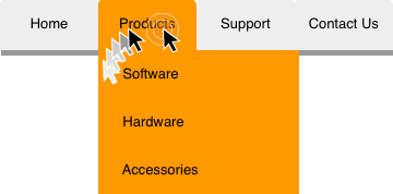
Tap Expands Menu, Tap Again Navigates
With this approach, one tap of a category on a touch device exposes menu items, and a second tap on the same category navigates to a category “landing page.” Essentially the first tap equates to a mouse hover, and the second tap a mouse click.
This is a very direct “mapping” of mouse to touch interaction. However, it does incur more “interaction cost” – that is, more taps are required to access the same information compared to mouse interaction. It’s also possible users will overlook category landing pages, not realizing a second tap is needed to reach them, so if those category pages have important content or valuable functionality, the next approach may be better.

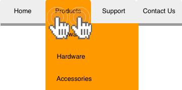
Single Tap Navigates
With this approach, tapping a category will always navigate to a landing page page, and does not expose deeper navigation items through global navigation.
This simplifies interaction – one tap of a menu item always navigates to a corresponding page. It also helps direct mobile traffic to category landing pages, which may be appropriate if those pages have valuable content and features.
However, this approach also requires those landing pages to handle any subsequent navigation within the category (or subsite). It also reduces scan-ability of your information architecture, so users on touch devices have less of a glimpse of full breadth of content and features on your site, and are more likely to overlook sub-categories. If the way your site is organized is well understood, and category landing pages are important, then this approach can work well. Otherwise, the previous or next design strategy may provide better results.
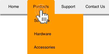
Single Tap Expands Menu
With this approach a single tap always expands a category menu, and never navigates to a category page – only when you tap on a navigation item with no sub-items will it navigate to a page. This helps brings your information architecture to the fore because it requires users to traverse your navigation hierarchy to get to information and features. If you don’t have category landing pages, then this is appropriate; however, if you do have category pages, then this approach makes them unreachable through global navigation, so should only be considered if those landing pages are of little or no importance.
The deeper the navigation hierarchy, the more challenging it is to visually represent, and the more compounded the challenges for touch interaction. While it’s important to organize content and functionality in an understandable pattern, keeping the levels of navigation hierarchy to a reasonable number – say 2 or 3 – will help your user experience on any platforms, but even more so on touch devices. And whichever navigation interaction you may decide to go with, it’s always a good idea to test with real users – after all, it’s never to late for usability testing.