Recent search ranking changes highlight importance of mobile
Google’s search ranking update released on April 21 was heralded by many as “Mobilegeddon,” a change to their ranking algorithm that would favour mobile-friendliness, and mark the beginning of the end for search ranking of non-mobile optimized sites. Many pictured prominent web properties disappearing from search results on mobile devices. And not long after Google rolled out their update, Bing announced a similar “mobile-friendly” boost in their ranking algorithm for search results delivered to smartphones.
The fallout from Mobilegeddon turned out to be less significant that predicted (and feared) by many, with reports in the search engine optimization (SEO) industry citing changes to rankings not being significant. But despite the lack of dire consequences, the uncertainty around being penalized in search ranking shone a light on the fact that surprisingly few sites are mobile-friendly, with stats such as “over 40 percent of Fortune 500 company’s websites are not mobile-optimized.”
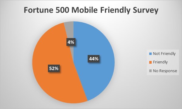
Image: TechCrunch
What may be more important than the immediate effect of Google’s algorithm change is the spirit of the update, and how it reflects Google’s vision for a mobile-friendly internet. Running Google’s Mobile-Friendly Test tool on a non-mobile optimized site provides recommendations that line up with essential good design practices for mobile-optimized webpages:
- Increase font size for improved readability on mobile devices
- Increase the size of buttons and links and the space in-between them to make them easier to touch
- Set mobile viewport so content is sized appropriately for mobile devices
- Ensure content fits within the mobile device screen
If that sounds a lot like Responsive Web Design, it’s no coincidence – responsive design is Google’s recommended design pattern. Although it’s not the only approach for mobile-optimizing a web page, responsive apps and websites are a good choice for a lot of sites, because they:
- Typically requires less development time then it takes to maintain multiple pages for the same content
- Makes it easier for users to share and link to your content with a single URL
- Requires no redirection for users to have a device-optimized view, reducing load time
- Helps search engines accurately index your content once, rather than in separate desktop and mobile pages
- Makes it more efficient for search engine indexers to crawl your site, helping you get indexed more frequently
Many took the impending doom of Mobilegeddon to heart – Google reports there was a 4.7% increase in mobile optimized sites in just the two months after the ranking algorithm update was announced. With luck, that trend will continue, if not accelerate – whether it’s done to help ensure optimal search ranking, or more importantly to provide a useful, usable and desirable mobile experience, the more websites going mobile-friendly, the better!